Friday, December 24, 2010

on the eve of christmas

Photobucket

A special greeting from Short & Sweet and For Design's Sake this holiday season! Hope you are enjoying company with family and friends...
More to come this special week!

Design from myself

Monday, October 4, 2010

in progress

Photobucket

Exciting stuff! I can't wait to get my blog & shop redesigned for you. Get ready for some new cards to delight your friends with this holiday season...

Stay tuned!

Sunday, March 7, 2010

SECRET ENVELOPE

wedding bells 2

wedding bells

Happy weekend! I got a creative and crafty this afternoon after I found this wonderful floral paper. Wondering what's in this little package? You'll have to wait til the next issue of Wedding Bells to find out! Thanks to Rosie for allowing me to showcase some fun wedding invite designs, can't wait to see the photo shoot!

Photos from myself

Saturday, February 27, 2010

SPRING CAME EARLY

sunny4

sunny2

sunny1

Happy weekend to all! If you're joining me here from for design's sake and wanted to see a bit more of my new card, thank you SO much! Yesterday my awesome friend Amanda took me to her school's letterpress studio so I could get my hands dirty and be creative. I can't even describe how good it felt, rolling that press over the lead letters...a designer's heaven! I wanted to do something bright and cheery, so sunny yellow it was! {seeing as it was super snowy and grey outside at the time}

Also, I love this card so much that I want to share it with all of you! It will be up for sale on my Etsy shop as of March 1st. Paired with a raspberry envelope {not shown here} it's sure to brighten anyone's day! Take note, there's a limited number of cards so better try and snatch up one fast!

Photos from myself

Saturday, February 20, 2010

STAMP HEAVEN

short 3

short 2

short1

vintage 1

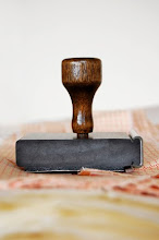
I have been trying to surround myself with inspiration lately as so many projects are going on and endless ideas need to be made. Last weekend I headed to the Cambridge Antique market for some cheering up and hope that I would find something really awesome. I DID! Among a few other little cool trinkets, the best find was a vintage rubber stamping set. All organized in a beautiful wooden box is the entire alphabet, numbers, other glyphs and flowery end notes. I couldn't believe I found this, all in working order too! I have yet to figure out what the font is, but am so excited to use it in upcoming stationery! How beautiful is that stamp FOR? This has definitely sparked some inspiration!

Hope your weekend brings some ideas too!

Photos from myself

Sunday, February 14, 2010

IN LOVE

love

Sometimes I can't help it, my nerdy font loving self comes out to play! I am in love with the font family Neutraface. Delicate and girly, Neutraface Slab is probably one of my favourites. The thin member of the family matches nicely with thick sans serif fonts and looks good in every colour imaginable, and the chunky member is fun and retro. I am desperate for a new project to give me an excuse to use it...

Fonts used: Neutraface Slab Thin, Neutraface 2 medium & Burgues Script

Sunday, January 31, 2010

UP UP and AWAY!

Etsy5

Etsy2

Etsy1

Etsy3

That's right everyone! My Etsy shop is now open for business! YAY! Thanks to all for your patience, I am so thrilled to share this with you.

Here's a little bit about my cards: All have a mix of media. Some are printed and also handstamped with rubber stamps, others I have used vintage printing letters for a more organic feel, and some will have a cutout. There are two Valentine's day cards that will be featured on the Paper Goods Showcase on Etsy on February 4th too! Have a peek, let me know what you think!

Monday, January 25, 2010

A HIGH FIVE GOES TO...

draw2

draw

draw1

The winner of my new year's draw...LOR!!! Thanks so much for your awesome words and encouragement. You won a high five card!! Please e-mail me all your contact info so I can send it on over asap. Thanks to everyone for being so awesome, what a great way to start the new year!

P.S. To add to the great news, my Etsy shop will be launching this weekend. I hope it's just in time for anyone to grab a cute Valentine's day card for the one they love...

Photos from Once Wed & Sycamore Street Press
Thursday, January 7, 2010

RING IN THE NEW YEAR WITH A GIVEAWAY!

Sycamore 1

Sycamore 2

Sycamore 3

Happy new year to everyone! Wow it has been a crazy couple of weeks, just catching up on life, getting my bearings again with work. Hope all of your holiday season was fantastic! The month of january for me will be super busy, filled with getting all of my stationery together, and making it look pretty in front of the camera to be put up on my etsy shop! One of my inspirations that I always go to is Sycamore Street Press. After my friend Amanda {a designer's blog} blogged about them, I was totally hooked and wanted more! Their cards and other paper things are bright and cheery and just make you feel good. I wanted to share this fun inspiration with you! So I decided to do a little Q&A with the Sycamore Street team.

1. How many people are on your team, and what are your background, designers, illustrators, etc, and how did you get started?

I (Eva) got my MFA in printmaking, and was planning on becoming an art professor. When a teaching job didn't land in my lap, I decided to create my own opportunity, and started Sycamore Street Press out of our little dining room. A few friends of mine got word that I was starting a letterpress business, and they asked if they could contribute some designs. Luckily for me, these friends happen to be fabulously talented and have really helped shape what Sycamore Street Press has become. Stephanie Ford has worked for years as a graphic designer in both Ohio and Utah. She designs our minimal but playful {Pop} line. Kristin Mills and Amy Shaffer have both worked for prestigious ad firms in New York and Utah: Kristin as a graphic designer, and Amy as a writer. Together, they write and design our pretty + funny {Lark} line. I use my background in fine art and printmaking to hand draw our {Folk} line. We also ask a different artist each month to create the artwork for our monthly Sycamore Club limited edition prints. Kirk helped out how he could while he was in school, but after he graduated this past May, we decided that he would join SSP full time. He has taken over most of the letterpress printing, and he does all of the shipping, sales, etc...It's been awesoem having his help, and needless to say, SSP has become so much more efficient and productive now that he's with me full time.

2. Where do you get most of your inspiration for the designs?

I can't speak for the other designers, but I am constantly looking around me for inspiration. I may find it in the colors on a box of candy, the shape of the mountains outside our windows, or the wallpaper pattern in an old movie. I also love design blogs, magazines, and books I find at the thrift store. One constant and yet diverse source of inspiration is folk art, whether it be Maori ta moko, Persian miniature painting, or New England scrimshaw. My most direct sources of inspiration for my Sycamore Street Press drawings and lettering are my great grandmother's Scandinavian rosemaling and the old Slavic engravings that I discovered while Kirk was studying Russian and Polish.

3. I enjoy how you keep everything handmade and eco-friendly. I come into contact with so many people daily that just love the look and feel of a handwritten card or note. Do you think, even though the internet is becoming so popular with e-cards and online blogs, that there is still a definite need and love for things handmade?

Definitely! In some ways, I think that with the increasing encroachment of technology in our lives, people are beginning to become more appreciative of the simple beauty of quality handmade objects. These days, if someone is going to take the trouble to send a handwritten note, they would like it to be on a beautiful little card -- whether it be letterpress, screenprinted, hand embellished, etc... That way, the card is a gift in itself. I love email, but I will never use it to the exclusion of a handwritten note.

4. What design of yours is your favourite and why?

From the {Pop} line: The Alphabet poster. It's like a well written, catchy pop song that won't get out of your head...ina good way.
From the {Lark} line: "I would trade two of my other friends for you" card. Amy's copy speaks for itself. And Kristin's design with the two silhouettes compliments the words perfectly.
From the {Folk} line: "Je T'Aime" (French Bulldog) card. My friend Zu's dog Felix is the muse and model for all my Frenchie drawings. It was Zu's idea that I use him and her idea that he say things in French. I just had to draw it out. Which is always fun.


5. Any tips for a designers itching to get into the stationery side of things?

Just start designing. Start an Etsy shop, and once it's looking full and you have good product photos, write around to some blogs you like and nicely introduce yourself and your work. Apply for a bunch of craft shows. Be prepared to work 10 times as hard as you would at a normal job for 1/10th of the pay...at least for the first few years.
Unless you don't want to have your own business and would prefer to work for someone else. Then I would have no idea how to break into that side of the business except to have a really fantastic portfolio.


Thanks Eva for all your fantastic advice and encouragement!
Now for the fun part! We're doing a GIVEAWAY!!! Here's how it works. Head on over to Sycamore Street Press and pick your favourite card, come back and comment on which one it is and why. If you're the winner, you will be getting your favourite card design in the mail! I will be drawing a winner on Monday, January 25th at 5pm. Good luck to all!


Saturday, December 26, 2009

SPARKLE & SHINE

sweet sea

sweet sea

I wanted to give you all a little taste of some of the petite treats I will be selling in my shop along with my stationery. These little "sweet sea" earrings will be making an appearance! I made these for my mom for Christmas and I loved them so much I have decided to make some more...They will also be in a few other colours such as "sweet rouge" and "sweet violet". They're simple, just the way I like it, and hope you will too!

Photos from myself

Friday, December 25, 2009

MERRY CHRISTMAS TO ALL

cards

Happy holidays to all my lovely readers! Wow, what a month this has been! Launching this blog right before the holiday season has been tough. I was busy, busy designing holiday cards, (as you can see a little taste of them above) and also my Valentine's Day stationery is at the printers as I type...I can't wait to show you! The next few weeks are going to be jam packed with photo shoots, (gotta make my cards look pretty for my shop!) getting all my matching envelopes and packaging done, and finishing up my business plan. Thanks for all your patience and encouragement over the past month, it has truly helped! Now I'm off to celebrate the day with my family...merry ho ho ho!

Photo from myself

Saturday, December 12, 2009

CANDY AT CHRISTMAS

chocolate 2

chocolate

As I was shopping around the other day, I popped into aerie to buy some festive little goodies. The bonus was that I got a bar of chocolate as a free gift! The chocolate was good, but it was the packaging that I was excited about! OH the polka dots and the gold foiling...and fling font!

Photos from myself